

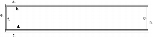
| |
| |
| |
| |
You can transform a TextArea component horizontally and vertically both while authoring and at runtime. While authoring, select the component on the Stage and use the Free Transform tool or any of the Modify > Transform commands. At runtime, use UIObject.setSize() or any applicable properties and methods of the TextArea class.
When a TextArea component is resized, the border is resized to the new bounding box. The scroll bars are placed on the bottom and right edges if they are required. The text field is then resized within the remaining area; there are no fixed-size elements in a TextArea component. If the TextArea component is too small to display the text, the text is clipped.
The TextArea component supports one set of component styles for all text in the field. However, you can also display HTML compatible with the Flash Player HTML rendering. To display HTML text, set TextArea.html to true.
The TextArea component has its backgroundColor and borderStyle style properties defined on a class style declaration. Class styles override _global styles; therefore, if you want to set the backgroundColor and borderStyle style properties, you must create a different custom style declaration on the instance.
If the name of a style property ends in "Color", it is a color style property and behaves differently than non-color style properties. For more information, see Using styles to customize component color and text.
A TextArea component supports the following styles:
|
Style |
Description |
|---|---|
color
|
The default color for text. |
embedFonts
|
The fonts to embed in the document. |
fontFamily
|
The font name for text. |
fontSize
|
The point size for the font. |
fontStyle
|
The font style, either "normal",or "italic". |
fontWeight
|
The font weight, either "normal" or "bold". |
textAlign
|
The text alignment: either "left", "right", or "center". |
textDecoration
|
The text decoration, either "none" or "underline". |
The TextArea component uses the RectBorder class to draw its border. You can use the setStyle() method (see UIObject.setStyle()) to change the following RectBorder style properties:
|
RectBorder styles |
|---|
borderColor
|
highlightColor
|
borderColor
|
shadowColor
|
borderCapColor
|
shadowCapColor
|
shadowCapColor
|
borderCapColor
|
The style properties set the following positions on the border:
| |
| |
| |
| |