

| |
| |
| |
| |
You can transform a Window component horizontally and vertically both while authoring and at runtime. While authoring, select the component on the Stage and use the Free Transform tool or any of the Modify > Transform commands. At runtime, use UIObject.setSize() or any applicable properties and methods of the Window class. For more information, see Window class.
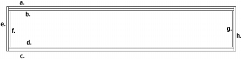
Resizing the window does not change the size of the close button or title caption. The title caption is aligned to the left and the close bar to the right.
The style declaration of the title bar of a Window component is indicated by the Window.titleStyleDeclaration property.
A Window component supports the following Halo styles:
|
Style |
Description |
|---|---|
|
borderStyle |
The component border; either "none", "inset", "outset", or "solid". This style does not inherit its value. |
The Window component uses the RectBorder class which uses the ActionScript drawing API to draw its borders. You can use the setStyle() method (see UIObject.setStyle()) to change the following RectBorder style properties:
|
RectBorder styles |
|---|
borderColor
|
highlightColor
|
borderColor
|
shadowColor
|
borderCapColor
|
shadowCapColor
|
shadowCapColor
|
borderCapColor
|
The style properties set the following positions on the border:
If you use UIObject.createClassObject() or PopUpManager.createPopUp() to create a Window instance dynamically (at runtime), you can also skin it dynamically. To skin a component at runtime, set the skin properties of the initObject parameter that is passed to the createClassObject() method. These skin properties set the names of the symbols to use as the button's states, both with and without an icon. For more information, see UIObject.createClassObject(), and PopUpManager.createPopUp().
A Window component uses the following skin properties:
|
Property |
Description |
|---|---|
skinTitleBackgroud
|
The title bar. The default value is |
skinCloseUp
|
The close button. The default value is |
skinCloseDown
|
The close button it its down state. The default value is |
skinCloseDisabled
|
The close button in its disabled state. The default value is |
skinCloseOver
|
The close button in its over state. The default value is |
| |
| |
| |
| |