

| |
| |
| |
| |
You can transform a List component horizontally and vertically both while authoring and at runtime. While authoring, select the component on the Stage and use the Free Transform tool or any of the Modify > Transform commands. At runtime, use the List.setSize() method (see UIObject.setSize()).
When a list is resized, the rows of the list shrink horizontally, clipping any text within them. Vertically, the list adds or removes rows as needed. Scroll bars position themselves automatically. For more information about scroll bars, see ScrollPane component.
You can set style properties to change the appearance of a List component.
A List component uses the following Halo styles:
|
Style |
Description |
|---|---|
alternatingRowColors
|
Specifies colors for rows in an alternating pattern. The value can be an array of two or more colors, for example, 0xFF00FF, 0xCC6699, and 0x996699. |
backgroundColor
|
The background color of the list. This style is defined on a class style declaration, ScrollSelectList. |
borderColor
|
The black section of a three-dimensional border or the color section of a two-dimensional border. |
borderStyle
|
The bounding box style. The possible values are: "none", "solid", "inset" and "outset". This style is defined on a class style declaration, ScrollSelectList. |
defaultIcon
|
Name of the default icon to use for list rows. The default value is undefined. |
rollOverColor
|
The color of a rolled over row. |
selectionColor
|
The color of a selected row. |
selectionEasing
|
A reference to an easing equation (function) used for controlling programmatic tweening. |
disabledColor
|
The disabled color for text. |
textRollOverColor
|
The color of text when the pointer rolls over it. |
textSelectedColor
|
The color of text when selected. |
selectionDisabledColor
|
The color of a row if it has been selected and disabled. |
selectionDuration
|
The length of any transitions when selecting items. |
useRollOver
|
Determines whether rolling over a row activates highlighting. |
A List component also uses the style properties of the Label component (see Using styles with the Label component), ScrollBar, and RectBorder.
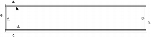
All the skins in the List component are included in the subcomponents from which the list is composed (ScrollPane component and RectBorder). For more information, see ScrollPane component. You can use the setStyle() method (see UIObject.setStyle()) to change the following RectBorder style properties:
|
RectBorder styles |
Border position |
|---|---|
borderColor
|
a |
highlightColor
|
b |
borderColor
|
c |
shadowColor
|
d |
borderCapColor
|
e |
shadowCapColor
|
f |
shadowCapColor
|
g |
borderCapColor
|
h |
The style properties set the following positions on the border:
| |
| |
| |
| |